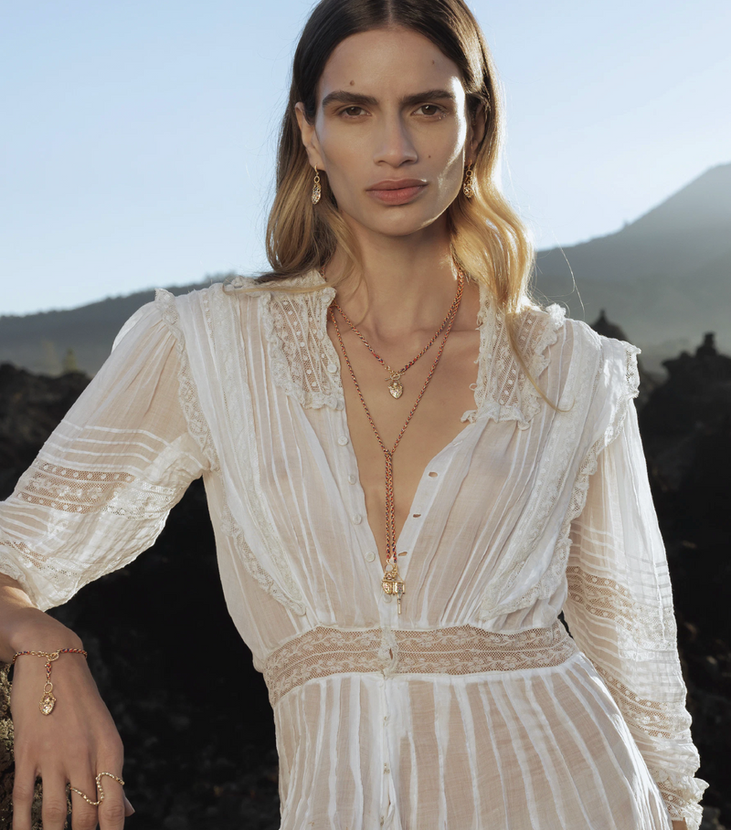
Pantone Fall Color Trends

Our go-to fall fashion color palette can feel a bit at times like a black and white movie—classic, but a bit outdated. To transform our autumn wardrobe from the waxen confines of Kansas to the rich technicolor land of Oz, we looked to the Color Wizard’s of fashion, The Pantone Color Institute. After surveying 21 designers about their color choices for the Fall 2016 season prior to NYFW, The Pantone Color Institute selected the top shades for their Fall fashion color report. The palette mainly includes reliable, but unexpected neutrals and soothing blues with a dash of warm reddish-browns and a potent pop of purple. To show off the power of Pantone’s dependable, confident top fall hues, we went full monochromatic, rocking each shade from head to toe.
Bodacious

PANTONE 17-3240—Bodacious is a surprisingly versatile vibrant hue. This rich blend of purple with a hint of chic pink is the perfect pop of color to jazz up your fall wardrobe. For an effortless ensemble, pair with Warm Taupe or Camel tones. For a simple sartorial statement, try a bold accent accessory like Osei Duro’s hand printed scarf. And if you want to stand out from the crowd, rock Jill Aiko Yee’s ombre dress. The influx of compliments will create instant confidence.
Sharkskin

PANTONE 17-3914—Sharkskin is the bright, light fall neutral with a bit of an edge. It pairs with almost any color for a solid ensemble and is the ideal shade for investment pieces like solid wardrobe staples. If you need a fresh winter coat, try Ali Golden’s notch collar style. Craving a dynamic dress, try layering an Organic by John Patrick number with cropped jeans for a cozy, cool look. You can’t go wrong with this sleek shade.
Airy Blue

Pantone 14-4122— Airy Blue is the lighter blue hue in Pantone’s palette this season and appeared in nearly half of the designers collections. The calming nature and lightness of the tone channels the freedom of a clear, cloudless sky, a comforting reminder to carry during cool, dark months. Pair it with dusty pinks or muted taupes for a change of pace. Try Frank and Eileen’s shirtdress alone or layered for a refreshing burst of brightness. Or blend the two blue hues— Airy Blue and Riverside— with Raquel Allegra’s indigo tie dye dress for a grounding, chic ensemble. Make blue your new black for a radiant fall vibe.
Aurora Red

PANTONE 18-1550— Aurora Red is a showstopper, packing a punch in contrast to the heavily neutral palette in Pantone’s report. The muted, warmth is fresh and dynamic. For a touch of edge, try Iro’s hole tee with washed out denim for a chic updated grunge look. For a sophisticated punch of color, try Sen’s cropped cigarette pant with a taupe top. Warning: Aurora Red breeds confidence. Wear it wisely.
Potter's Clay

PANTONE 18-1340—Potter’s Clay is a classic fall tone we aren’t shocked to see, but happy to embrace. The russet orange undertone brings substance to this otherwise neutral earth hue. Pair potter’s clay with blushy pinks or bold blues for a look of grounded sophistication. Try Black Crane’s origami dress for a chic, mellow autumn vibe. When the leaves start changing, fall back on this autumn hue to blend with the season.
Warm Taupe

PANTONE 16-1318—Warm Taupe is camels lighter, sophisticated cousin. This organic neutral is timeless and pairs well with basically any color, but if we had to choose, we prefer it best with bodacious. The timeless tone is far from tacky khaki with its soothing depth and rich earthy foundation. Try layering Black Crane’s Long slit top or dress with cropped jeans for an on trend, comfy fall ensemble. With such a pleasing complexion, Warm Taupe is our favorite neutral of the season!
Riverside

PANTONE 17-4028— Riverside is the darker blue of the bunch, but still light enough to catch the eye. This oceanic shade is calm and strong. For an elevated fall ensemble with unexpected depth, try Ace & Jig’s echo print top and hot cross romper. It pairs well with everything, like a pair of blue jeans. You simply can’t go wrong with this rich blue hue.
( Top Photo: Cropped Sweater, High Waist Jeans)